

Café Charlot
Branding Case Study, 2022
Café Charlot is a small café located in Rue de Rivoli, Paris, France. The café serves your daily dose of espressos while also offering a various selection of breakfast dishes and classic French pastries.
* The featured brand is a fictional brand and is not related to any brand having similar names.

The café was established in 2020 and is fairly new in the industry. However, I wanted to make sure that it will look classic and would share different stories with its customers and consumers. With that, I opted for a look that is leaning more on the vintage and classic style by using a serif font as the main font and incorporating it thought the whole branding.


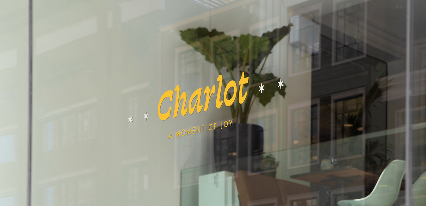

The main color used in the branding is the Linen Blue partnered with a lighter shade, Cloud Blue, and a neutral color called Porcelain. The golden yellow accent color, Sunrise, will bring more life and vibrancy to the brand. It also contrasts pretty well on Linen Blue and works well with both Cloud Blue and Porcelain.
For the typography, the classic serif header shows a unique personality very suited for the cafe. It is distinct and gives off a classic look inspired by old signages. To bring a bit of a modern feel to it, a secondary sans serif font will be available for use in subheaders. Finally, the serif body text is guaranteed to be easily readable in different materials both online and print even in smaller sizes.
Brand Applications


The brand application features elements from the main logomark while also incorporating new and similar elements that will make the brand look more cohesive. The approach on the brand identity leans toward minimalism and incorporating contemporary design styles to the existing classic look of the brand while making sure that the brand still looks clean, calm, and cohesive. The various marks are used in different applications where they are deemed fitted to.
The brand applications also left room for negative spaces to make sure that it looks neat and organized, to give focus on what is important, and give a feeling of calmness and relaxation to the customers of the cafe.


Poster Applications

To add a more classic feel to the branding, classic paintings from France or paintings done by French artists were incorporated and used as a marketing material for the branding of the cafe. The use of these public domain classic masterpieces in new ways allow it to be seen and appreciated by more people.


